All credit to this goes to Solais on the Animesuki forums for noticing and posting (click me) on this subject. So read it before proceeding any further!
I was not meaning to make a post today, and was trawling through the ARIA thread in animesuki as usual when I came across that post which seemed perfectly plausible.
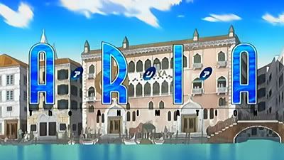
The deep blue logo of season 1, ARIA the Animation. The colour of the water in the soft rays of morning sunlight.
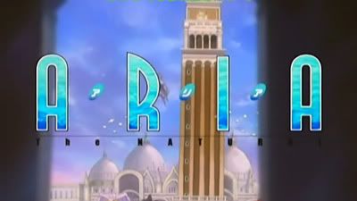
The light blue logo of season 2, ARIA the Natural. The colour of the water in the strong afternoon sun.
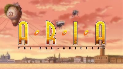
The logo of the DVD-only Aria the OVA ~ ARIETTA ~, the colour of the water under the setting/twilight sun.
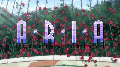
Season 3, ARIA the Origination logo with a mix of blue and purple. The kind of colour you get in a clear night with a full moon.
The beginning, middle, near-end and the end of the day covered through different colours. A hidden reference at the different beginning, middle and end stages of the story of ARIA?
This idea seems to make complete sense! Many thanks to Solais for noticing this.
10 years ago


3 comments:
Wow, I've never thought that my finding will be THAT interesting. Well, it's interesting to me, because I get amused by little things "what doesn't matter".
Ahh so that's who you are. :) I also like the small things and deconstructing meanings and references when possible!
wah wah wah, I want to rewatch aria all over again as of right now.
Post a Comment